Ant Design Charts for Figma
Ant Design Charts for Figma
Figma UI kit built on Ant Design Charts — 600+ chart components covering line, bar, pie, scatter, heatmap, treemap, and more. Three themes, Variable Modes, and direct links to chart code.
Ant Design Charts for Figma is a UI kit built directly on the Ant Design Charts library. Whether you are working on a dashboard, analytics platform, or business intelligence tool, it gives you over 600 production-ready chart components in Figma that translate directly into working React code — without rebuilding every visualization from scratch.
600+ chart components, ready to use
Stop building chart components from scratch. This kit covers every major visualization type from the Ant Design Charts library, all organized for fast discovery in the Figma assets panel.
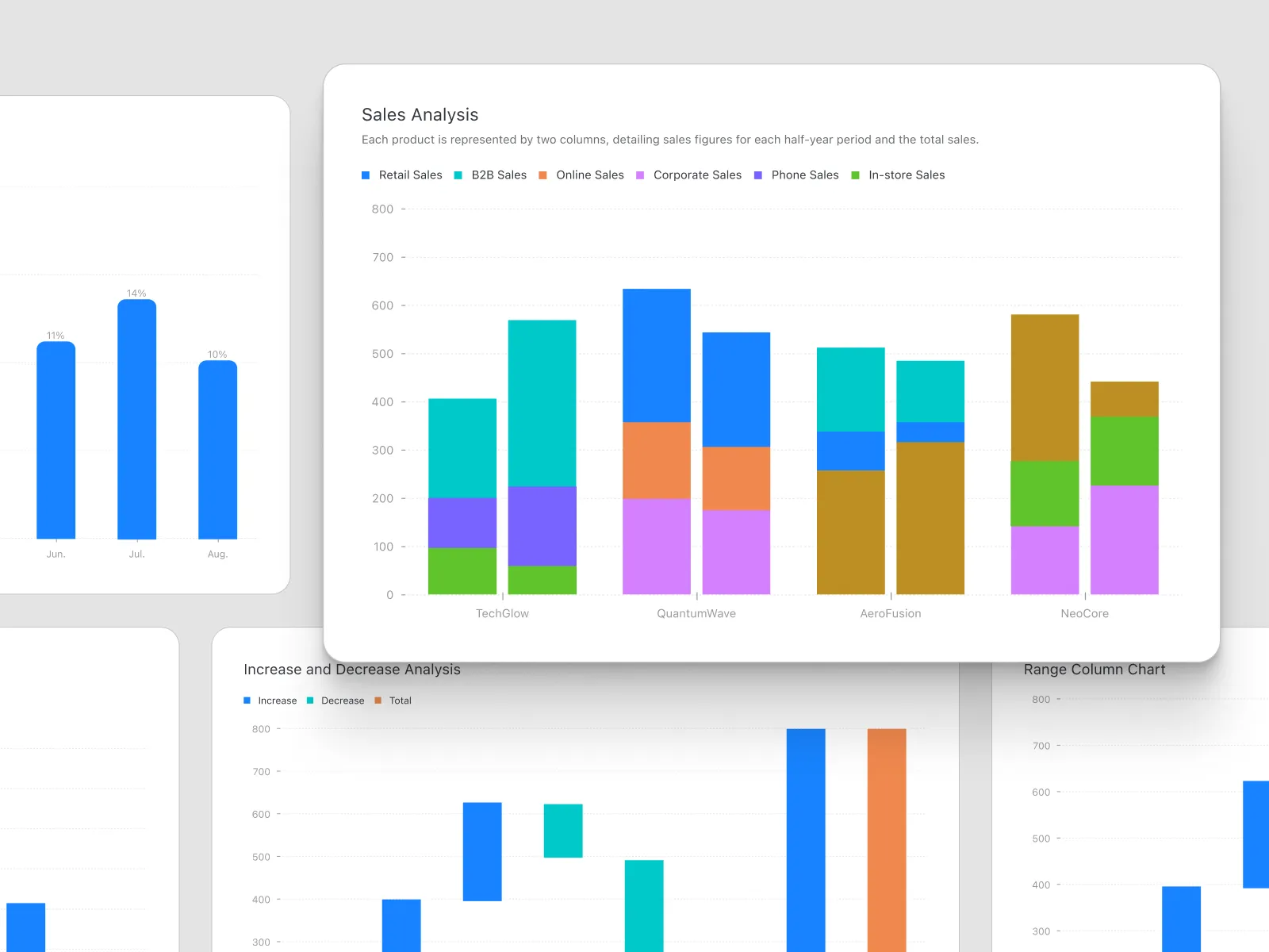
- Basic charts: Line, area, column, bar, pie, donut, rose, and scatter
- Advanced charts: Heatmap, treemap, radar, funnel, gauge, waterfall, dual axes, and sankey
- Statistical: Histogram, box plot, violin, and bullet charts
- Financial: Stock (candlestick) charts with OHLC layout
- Tiny charts: Spark line, spark column, spark area, and progress for inline data display
- Other: Venn diagrams, word clouds, liquid fill, and sunburst
Every component follows Ant Design Charts visual and functional standards, so what you design in Figma closely mirrors what developers will build in React.
Three themes and Variable Modes
Charts rarely look the same across projects. Every component in this kit is designed to be customized without friction — colors, fonts, sizes, axes, legends, and labels. Three themes are included out of the box, and Figma Variable Modes let you switch between them globally in a single click without touching individual components.
- Swap the entire color palette across all 600+ components at once
- Adjust axis labels, grid lines, and legend styles through shared styles
- Map brand colors to chart tokens for consistent data visualization
Works seamlessly with Ant Design System for Figma
If you are already using Ant Design System for Figma, adding this charts library is straightforward. Publish it to your workspace and get instant access to hundreds of charts alongside your existing UI components — one cohesive design system with no visual mismatches between UI and data layers.
Smoother developer handoff
Every chart component includes a direct link to its code equivalent in Ant Design Charts. Developers do not have to guess behavior because the design specification and code reference are connected from the start.
- Chart type names match the Ant Design Charts React component API
- Less back-and-forth between design and engineering
- Fewer surprises during implementation
- Faster time from design approval to shipped feature
Designed for teams
A shared chart component library means everyone works from the same source of truth. Designers use the Figma components, developers use the matching Ant Design Charts React components, and both sides share the same names and configurations.
- Standardized components that communicate design intent clearly
- Fewer revision cycles caused by inconsistent styling
- Easier onboarding for new team members
Ideal use cases
- Admin dashboards with financial metrics, KPIs, and operations
- Analytics platforms with time-series, distribution, and comparison charts
- Business intelligence tools for reporting and trend analysis
- SaaS products surfacing usage data, funnels, or retention metrics
- Data-heavy web applications that need consistent chart styling across the product
Key features
Frequently asked questions
Is this kit based on the official Ant Design Charts library?
Yes. All components are built to match the Ant Design Charts (charts.ant.design) specifications, so chart types, naming, and visual standards align with what developers implement in React.
What chart types are included?
The kit covers basic charts (line, area, bar, column, pie, scatter), advanced visualizations (heatmap, treemap, radar, funnel, gauge, waterfall, sankey, dual axes), statistical charts (histogram, box plot, violin), financial charts (stock/candlestick), tiny charts (sparkline, spark column), and others including word cloud, liquid fill, venn, and sunburst — over 600 components in total.
Can I switch themes across all chart components at once?
Yes. Three themes are included out of the box, and Figma Variable Modes let you switch the active theme globally across all 600+ chart components in a single action — no manual per-component edits required.
Does this work alongside Ant Design System for Figma?
Yes. Publish both libraries to your Figma workspace and access UI components and chart components together. They share the same visual language so there are no styling mismatches between the UI layer and the data visualization layer.
Speed up your design and development process
Stop starting from scratch for every project. Use pixel-perfect elements to efficiently design your next Ant Design app.