Figma Slots update for Ant Design System and Ant Design Mobile
We've upgraded Ant Design System for Figma and Ant Design Mobile for Figma with Figma's new Slots feature, making component customization more flexible than ever.
Today we're shipping a significant update to two of our Figma kits — Ant Design System for Figma and Ant Design Mobile for Figma. Both kits have been updated to take advantage of Figma Slots, a powerful new capability that makes component customization far more flexible and intuitive.
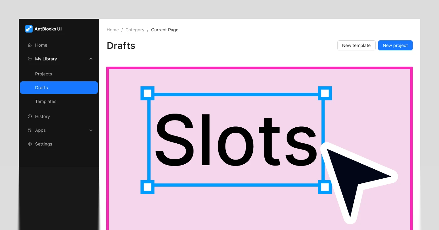
What are Figma Slots?
Figma Slots let you swap content directly inside a component instance — without detaching it, creating overrides, or digging through layers. Instead of being locked into what a component ships with, you can drop in your own icons, labels, images, or nested components right where you need them.
For design systems at the scale of Ant Design, this is a big deal. Many components — buttons, inputs, list items, cards, navigation elements — accept prefix/suffix icons, custom avatars, action menus, or arbitrary content regions. Slots make all of that composable and clean, the way it should be.
You can learn more about Figma Slots in the Figma documentation.
Ant Design System for Figma 6.3
We've gone through the kit and introduced Slots across components that benefit from the most from them. Components with prefix/suffix content areas, icon swap points, and nested content regions now expose these as proper Slots rather than deeply nested layer overrides.
This means:
- Fewer detaches when customizing components
- Cleaner layer structure in your files
- Easier handoff — Slots make intent explicit for developers reading the design
Preview the new Ant Design System for Figma 6.3
Changelog
- Added Slots to components:
- General — Button, FloatButton
- Layout — Grid, Layout, Space, Splitter
- Navigation — Anchor, Breadcrumb, Dropdown, Menu, Pagination, Steps, Tabs
- Data Entry — AutoComplete, Cascader, DatePicker, Form, Mentions, Radio, Select, TimePicker, Transfer, TreeSelect, Upload
- Data Display — Avatar, Calendar, Card, Collapse, Descriptions, Image, Segmented, Table, Timeline, Tooltip, Tour, Tree
- Feedback — Alert, Drawer, Modal, Notification, Popconfirm, Result, Spin
- Other — Affix, List (Deprecated)
- Ant Design X — Bubble, Conversations, Welcome, Prompt, Attachment, Sender, ThoughChain, Think, Sources, Examples
- Ant Blocks
- Components: App Shells Items / Menu, App Shells Items / Drawer, App Shells Items / Submenu, AppShellSider Mobile, Footer Item, ListSectionColumns Item, ListSectionHeaderButtons Item
- Empty Sections
- Grids
- Panels
- Headers: Header with search and avatar, Header with information
- Lists
- Navbars
- Section Headers
- Deleted bottom border from Navigation Steps example according to documentation.
- Unified size enumeration: replaced
defaultwithmediumfor Badge, Card, Progress, Steps, Switch and Spin; replacedmiddleanddefaultwithmediumandlargefor Descriptions; replacedmiddlewithmediumfor Table.
Ant Design Mobile for Figma 5.4
The same treatment has been applied to Ant Design Mobile for Figma. Mobile UI patterns lean heavily on composable content — list items with custom leading/trailing elements, nav bars with action slots, form fields with prefix content. All of these have been updated to use Slots where applicable.
Preview the new Ant Design Mobile for Figma 5.4
Changelog
- Added new components:
- PulltoRefresh
- Segmented
- Added slots to components:
- AutoCenter
- Grid
- SafeArea
- Space
- CapsuleTabs
- IndexBar
- JumboTabs
- SideBar
- TabBar
- Tabs
- Card
- Collapse
- FloatingPanel
- InfiniteScroll
- List
- Steps
- Swiper
- Footer
- Cascader
- CheckList
- Form
- Input
- Picker
- PickerView
- Slider
- ActionSheet
- Dialog
- ErrorBlock
- Mask
- Modal
- Popover
- Popup
- SwipeAction
- Segmeneted
- Calendar
- CalendarPickcer
- CalendarPickerView
- Dropdown
- Change color of linear in Capsule Tabs component and added custom color color-background\10.
- Added new wariants to Tabs
- Added new variant to CheckList
- Updated Stepper component to match documentation
- Added new variant to Rate: Rate + Label
- Added new variant to SearchBar: Search + Button
- Added new variant to Selector
- Added new variant to Switch: Switch / Custom
- Empty component has been deprecated and removed from document.
- Added new variants to Popup component
- Added new variants to ProgressBar
- Added variant to Toast
- Added new variants to NoticeBar
- Divided Cascader View and Cascader into two components according to documentation.
- Fixed PasscodeInput border radius
- Added new variants to NumberKeyboard and redesign it according to documentation