How to choose the best Figma UI Kit? 6 crucial factors and how we address them in Ant Design System for Figma
Discover how to choose the best Figma UI kit for your next project. Learn six key factors and see why the Ant Design System for Figma stands out.
Selecting the best UI kit for Figma for your next project can be daunting due to the overload of options available. To ease your decision-making process, it is essential to consider several critical factors that a robust design system for Figma should meet. These factors will not only enhance your efficiency but also speed up your workflow while working on a project, both in design and development. Below are the key elements you should consider when choosing the UI kit for your next project. You will also learn how we address these factors in the Ant Design System for Figma, so it’s the best UI kit for Figma that will make you deliver your project faster.
The golden rule. Make the tool work for your team, not the other way around.
Let’s put it straight. A UI kit or design system for Figma (just like Figma itself) is a tool designed to help designers and developers communicate. Designers create the layouts, and developers code them. Without developers, Figma designs are merely images.When selecting the best UI kit for Figma, it's crucial to remember that the UI kit should serve your team, not the other way around. You need a solution that significantly eases your developers' work and saves time.Unfortunately, many Figma UI kits miss this point. They focus primarily on the designers' workflow, overlooking the target users who will be interacting with the finished designs. While making designers' tasks easier within Figma is essential, a balanced approach is necessary.
In essence, your UI kit should work for your team, not vice versa. What does "work for you" mean? A good UI kit should handle much of the additional work your team would need to do when working on a project. Picking the best Figma UI kit can save hours of your team's work. Below, I describe all the crucial factors you need to consider when looking for a tool that works for you, not the other way around.
1. Based on the code library
There are many stunning, well-designed UI kits available in the Figma Community, offering almost irresistible and visually appealing UI examples. However, most of these UI kits are merely component libraries within Figma and do not incorporate coded frameworks as their foundation. This presents a significant challenge; selecting such a UI kit means your developers must start coding components from scratch or restyle different code libraries to match the attractive UI kit’s design. This can take days or weeks—time better spent building actual screens or coding logic. This scenario exemplifies working for a tool: choosing a visually enticing library but forcing your developers to code these beautiful components from scratch.Here’s a crucial tip: Choose a UI kit built upon a robust, open-source code library. This approach not only saves development time but also streamlines communication, as the naming conventions for components and variables will align between designers and developers.
Most UI kits in the Figma Community primarily focus on visual aesthetics and do not have corresponding code equivalents. This often leads to a disconnect between design and development, causing inefficiencies and inconsistencies. However, the Ant Design System for Figma is fully integrated with the Ant Design (React) code libraries, ensuring seamless alignment between what you design in Figma and what gets implemented in the code. This integration fosters a smoother workflow and facilitates better communication between designers and developers.
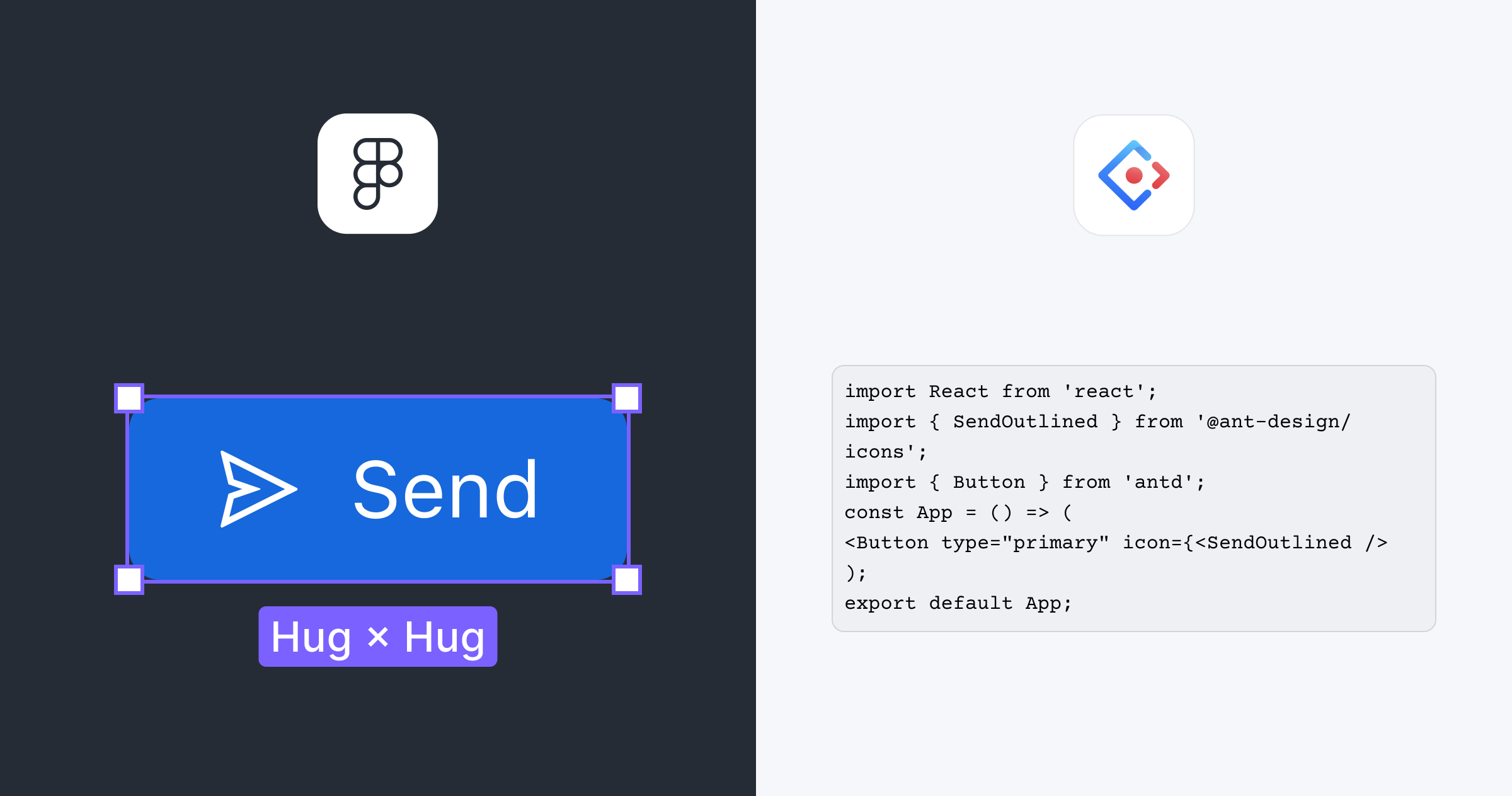
Ant Design System for Figma follows the foundations of Ant Design of React
2. The amount of the components
In addition to selecting a UI kit for Figma built on an established coded framework, another critical factor to consider is the number of components included in the UI kit and the associated framework. A greater variety of components means less time and effort for your designers and developers to construct these elements from scratch.
More components mean your team can quickly assemble interfaces without manually building each element, enhancing time efficiency. A comprehensive library ensures a consistent look and feel throughout the application, adhering to the design system, which boosts productivity by reducing redundancy. Moreover, a rich set of components enables rapid prototyping, allowing quicker iteration and refinement of design concepts. A diverse component library allows for a streamlined drag-and-drop design process when your project requires various UI elements, such as buttons, input fields, navigation menus, forms, modals, and icons. This approach minimizes the need for custom coding, enhances UX/UI consistency, and improves collaboration, as teams can use standard components directly from the kit. Ultimately, having a vast array of pre-built components makes it easier to scale your project, as new features can be integrated seamlessly.
The Ant Design System for Figma boasts a wide array of 4000+ components (including variants) that look good and are built for practical use. This comprehensive library includes everything from basic UI elements to complex interactive components, catering to the diverse needs of modern web and mobile applications.
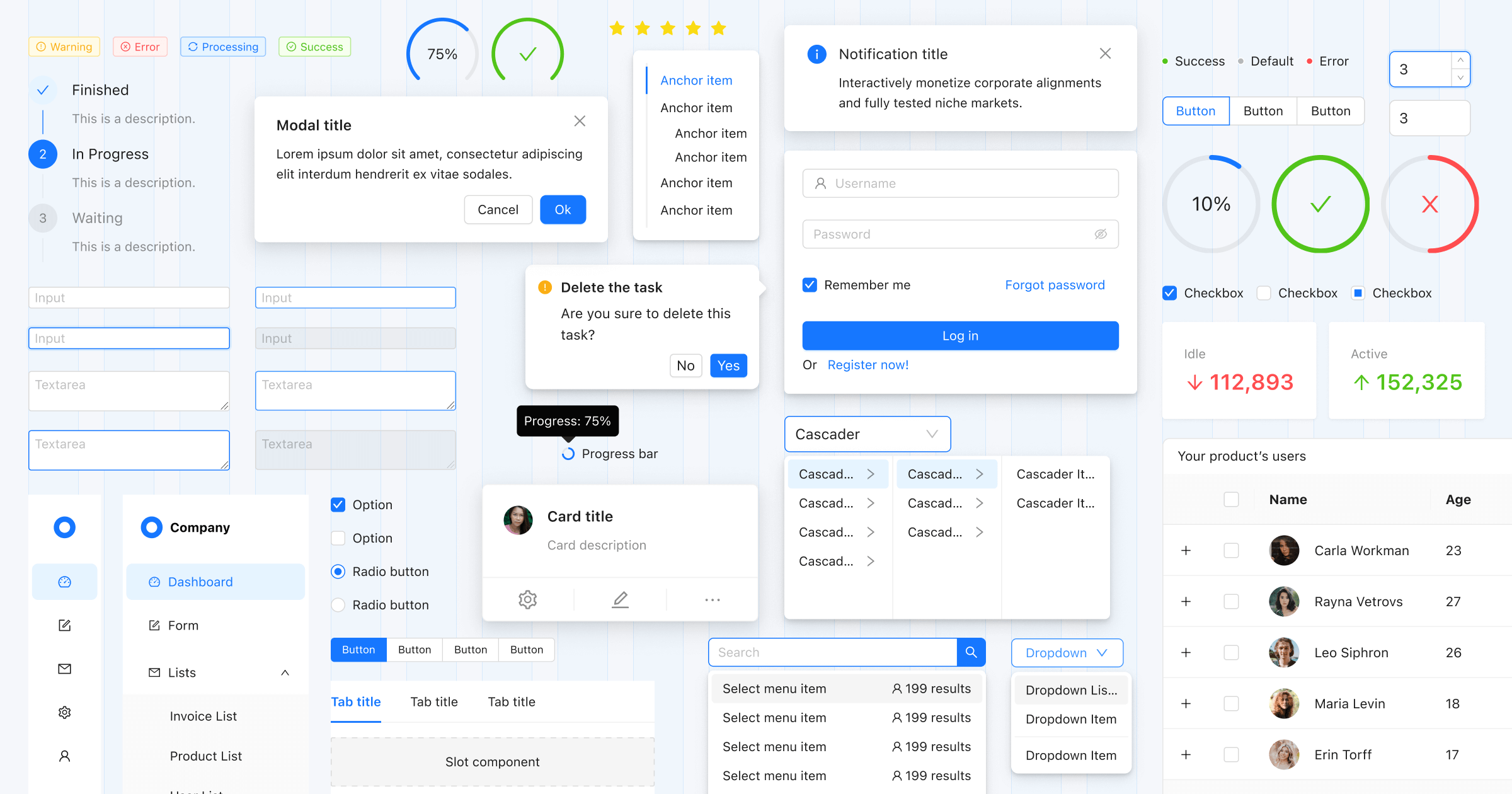
3. The quality of the components
The quality of components in a UI kit is just as crucial as their quantity. If the components are of great quality and well-thought-out, the UI kit will save your team time.
For developers
Naming
Components must have consistent naming conventions that align with the code library. This ensures seamless integration and minimizes confusion during the development process. Consistent naming also helps developers quickly identify and use components, leading to a more efficient workflow and reducing the likelihood of errors.
Documentation
Each component should also be accompanied by comprehensive documentation and sample code. Detailed documentation provides developers with clear guidelines on implementing components correctly, covering various use cases and potential customization options. Sample code, meanwhile, offers practical examples that demonstrate the components in action, making it easier for developers to understand their functionality and integrate them into the project. This level of support is invaluable for streamlining the development process and ensuring that components are used effectively.
Icons
Icon names should also be consistent with those in the code library. This uniformity ensures that developers can easily match design elements from the UI kit with their code counterparts, further simplifying the workflow. Consistent icon naming reduces the time spent searching for the right icons and prevents discrepancies between the design and implementation stages. This alignment enhances productivity and helps maintain a cohesive and polished final product.
The Ant Design System for Figma is a boon for developers as it aligns perfectly with Ant Design code library. It offers sample React code for the components and icons directly in the inspect panel, alongside quick links to detailed documentation, making the transition from design to development smoother.
For designers
In addition to these developer-focused features, quality components should leverage Figma’s robust capabilities, including Auto Layout, Components, Variants, and Variables. These tools enable designers to create responsive, flexible designs that adapt to various screen sizes and devices, enhancing user experience. Utilizing these functionalities ensures your workflow is more efficient, adaptable, and consistent. Here’s how these features contribute:
Customizability and Variables
Customizability is critical, allowing designers to tailor components to fit specific project needs and brand guidelines. The ability to easily adjust colors, typography, and other stylistic elements ensures that the design system remains versatile and scalable.
Variables in Figma allow you to create and manage reusable values across your design projects. In the Ant Design System for Figma context, variables enable you to maintain consistency in design tokens such as colors, typography, and spacing. This speeds up the design process and ensures all components adhere to your brand guidelines. When you update a variable, all instances where it's used are updated automatically, making it incredibly easy to maintain and manage design consistency across large projects.
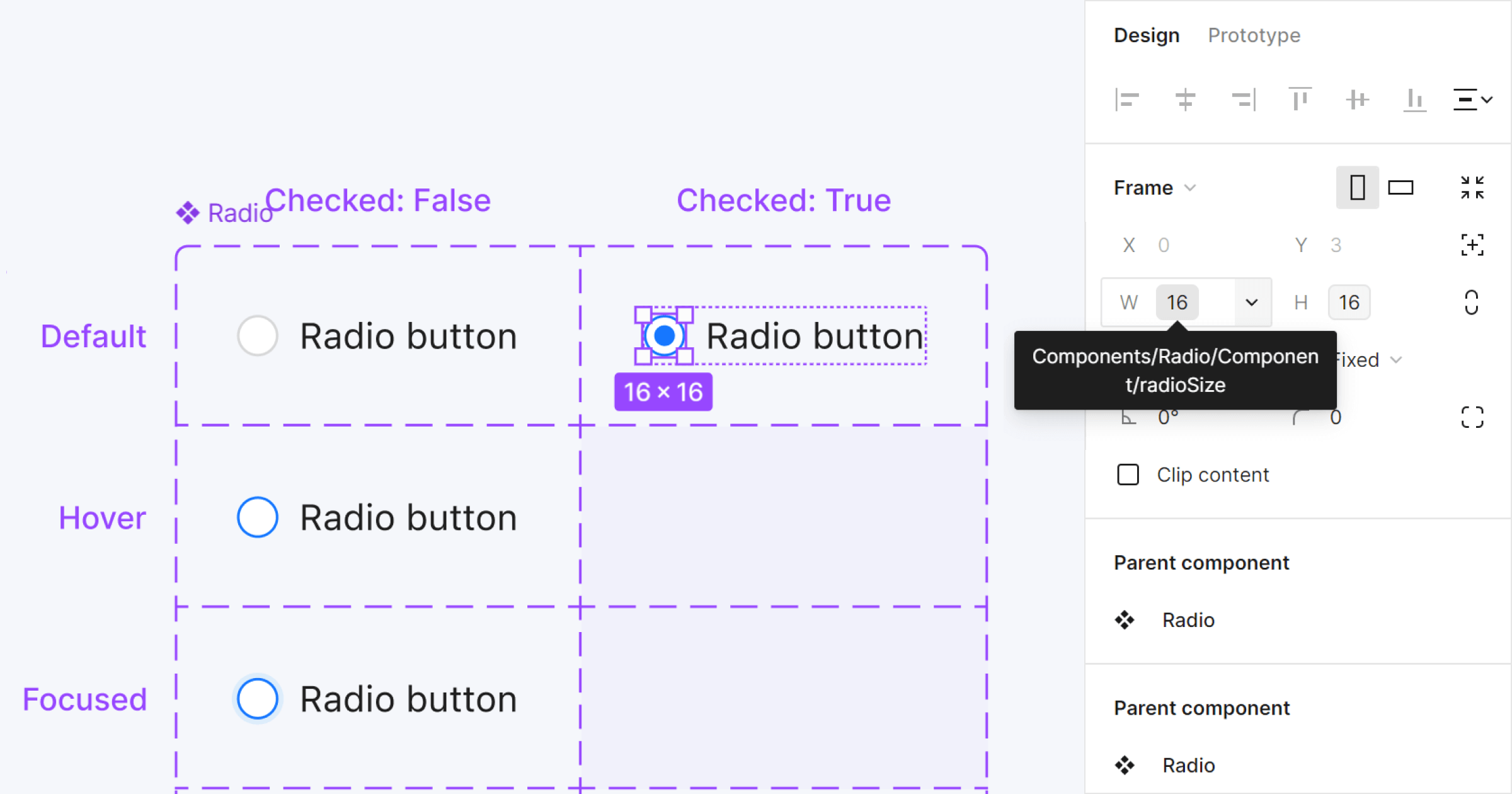
Each component in Ant Design System for Figma is built with variables (tokens) from Ant Design
Auto Layout
Auto Layout is a powerful feature in Figma that automatically allows components to resize and reposition based on their content. The Ant Design System for Figma incorporates Auto Layout to create responsive and flexible components that adapt to various screen sizes and effortlessly change content. Figma will dynamically adjust the spacing and alignment as you add or remove elements within a layout. This feature reduces manual adjustments, minimizes errors, and ensures a more fluid and adaptive design process.
Components and Variants
Components and Variants are essential features in Figma that allow you to create reusable design elements and manage different states or versions of these elements efficiently. The Ant Design System for Figma extensively uses Components and Variants to provide a robust set of building blocks for your projects. Components ensure that any changes to the main component are reflected in all instances, maintaining consistency and saving time. Variants enable you to manage different states (like hover, active, or disabled) of a component within a single frame, making it easier to visualize and implement complex interactions and styles.
By prioritizing these aspects of component quality—consistent naming conventions, thorough documentation, sample code, and alignment with the code library—UI kits can effectively bridge the gap between design and development. This approach streamlines the workflow for designers and developers and contributes to creating a unified, high-quality final product.
4. Figma to Code
When selecting the right design system for Figma for your next project, it's important to consider how it can reduce repetitive tasks for designers and developers during the coding phase. Transferring styling from Figma to your code project can be very time-consuming, with even the best developers potentially missing details on component colors, radii, or sizing. The situation gets even more complex when designers make changes after the initial implementation, as they must communicate these changes to developers, which takes significant time and effort. This unnecessary workload can be frustrating for developers. In the past, our team has also dealt with this, resulting in wasted client resources on repetitive tasks.
Today, we use a dedicated Figma plugin called Theme Buddy for Ant Design, which allows us to transfer styling from the Ant Design System in Figma to our code projects in seconds. This eliminates communication issues and the need to prepare changes manually. Simply opening the Theme Buddy plugin generates a JSON file with all the variables for light and dark modes, which developers can copy and paste into their React project, making the code project restyled in seconds. This greatly improves the collaboration between design and development, letting us concentrate on more significant project aspects. Many UI kits lack such features, forcing designers and developers to handle repetitive and monotonous tasks.
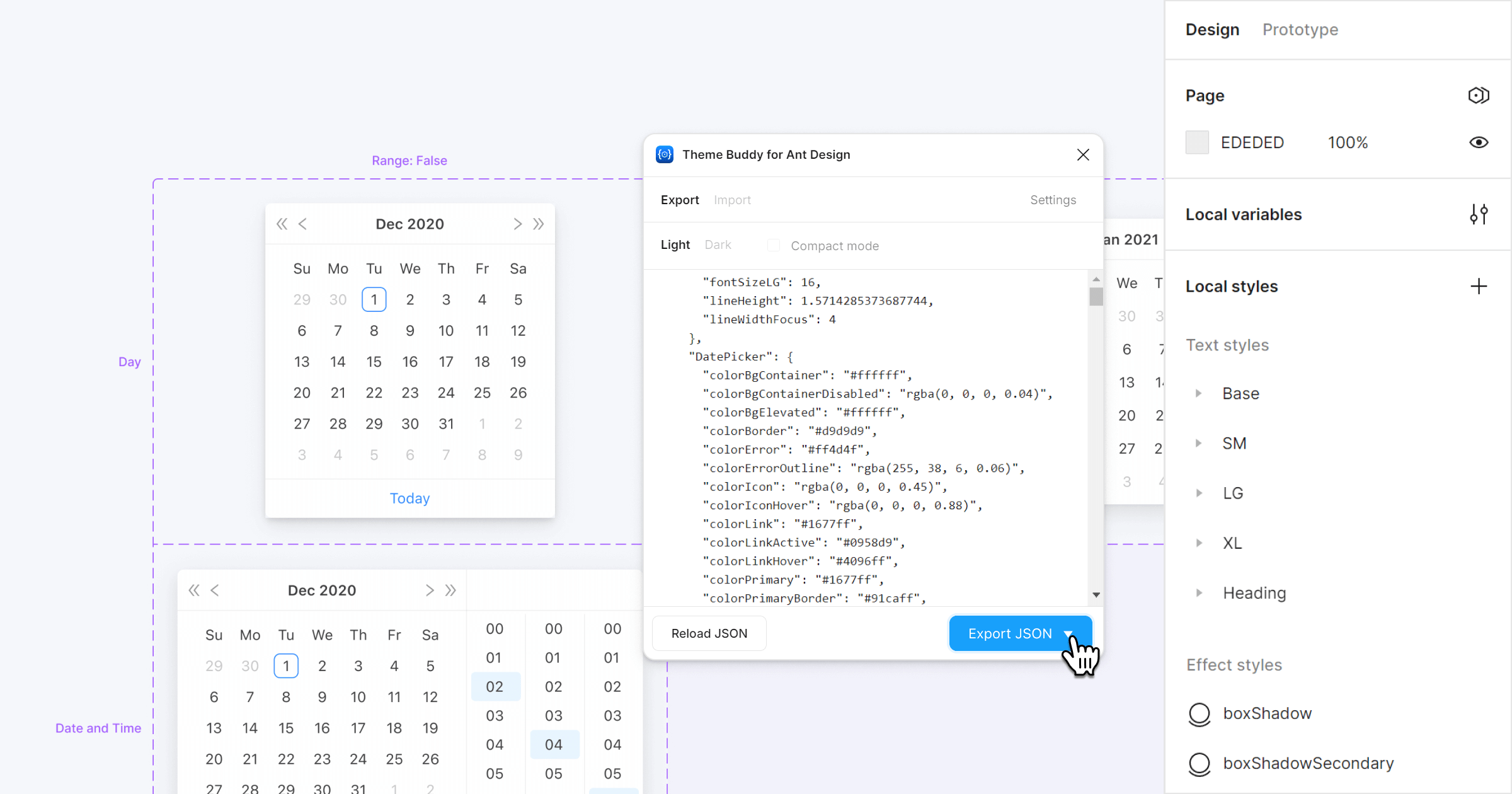
Theme Buddy Figma plugin - copying the theme style's JSON from Figma to code
5. Support and documentation
Another crucial aspect of an ideal UI kit for Figma is robust support and comprehensive documentation. Good documentation lets your team start working with and customizing the UI kit immediately. Questions are inevitable, as UI kits are utilized not only by senior designers but also by junior designers, developers, project managers, clients, and small business owners. Quality documentation should be embedded within the UI kit itself, eliminating the need to search the web, and it should cover all necessary aspects for customization, usage, and modification.
Moreover, the UI kit team should offer prompt support for your team. Not all advanced topics may be covered in the UI kit's documentation and might not even be found in Figma's documentation. That’s why dedicated support is crucial. Relying on free resources in the Figma community for quick responses can be futile, as evidenced by the extensive, often unanswered comments.
The Ant Design System for Figma comes with comprehensive documentation within the Figma file. This documentation covers everything from customizing and using the Figma UI kit to detailed instructions on using our Theme Buddy Figma plugin. It also includes specifics on component coding and customization! Additionally, we ensure all customer messages are responded to within 48 hours. To provide the best expertise, most responses come directly from me, Matt, the creator and founder of the Ant Design System for Figma.
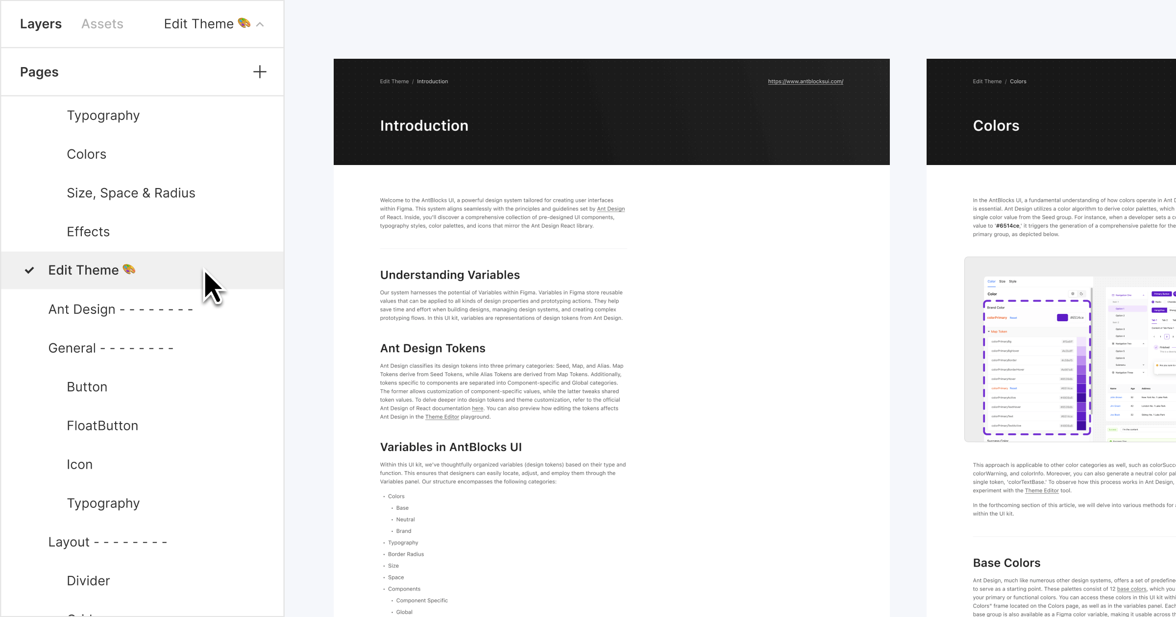
Documentation within the Ant Design System for Figma file
6. Frequent updates
The final factor to consider when selecting the best UI kit for Figma for your next project is the frequency of updates. A UI kit that follows a code library must be frequently updated to align with new changes in the code version. This is crucial because an outdated Figma UI kit can lead to inconsistencies between design and code, forcing your team to address these discrepancies and wasting time on tasks that should be handled by the UI kit creators.
When evaluating a code library, it's worth checking if it has a frequently updated UI kit for Figma. This ensures your design team can work without blockers, such as designing new components to match the code library or adding missing features in Figma. Additionally, a frequently updated UI kit allows you to leverage the latest Figma features. As Figma continuously introduces new improvements and features, staying up-to-date ensures that your team can work with the newest additions seamlessly.
We released the first version of the Ant Design System for Figma in June 2019. Whenever there is a significant update to Ant Design or when Figma introduces a new improvement or feature, we incorporate these into the Ant Design System for Figma in its next version. From 2019, we uninterruptedly and frequently update our UI kit to ensure consistency with the code library and the latest Figma features. Our focus extends beyond just one resource; we also maintain and update additional resources such as Ant Design Mobile for Figma, AntBlocks UI, and the Theme Buddy plugin. For more details, check our updates page to see why Ant Design System for Figma is the most frequently updated UI kit available.
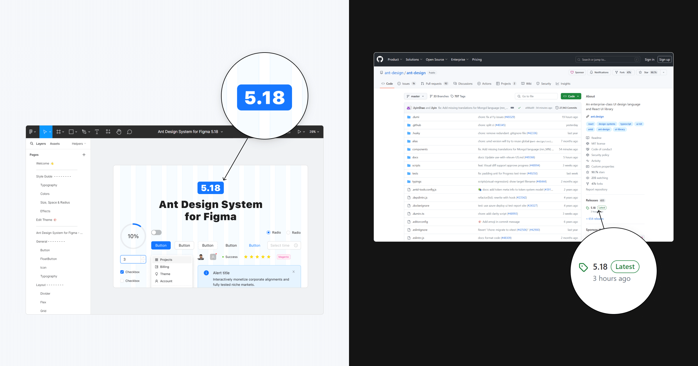
Ant Design System for Figma follows the Ant Design updates
Summary
Given the multitude of options available, choosing the ideal UI kit for Figma can be daunting. A robust design system should enhance both design and development workflows, reducing repetitive tasks and ensuring consistency between design and code. Throughout this article, we've identified key factors to consider when selecting a UI kit, such as alignment with a code library, a comprehensive component set, high component quality, efficient Figma-to-code processes, robust support and documentation, and frequent updates.
The Ant Design System for Figma addresses all these factors, making it an exceptional choice for your next project. With comprehensive documentation, seamless integration with Ant Design code libraries, a wealth of high-quality components, and frequent updates, it streamlines the workflow for designers and developers alike. Additionally, our dedicated support ensures you have the help you need when you need it.
Explore the Ant Design System for Figma, the best Figma UI kit, and see how it can accelerate project delivery and enhance your team's efficiency.